Design Work
Design
Create
Selected Design Work
Branding, interface design and product thinking.
This work spans visual identity, icon systems, interface concepts and product UI. Some pieces are standalone brand assets, while others support larger journeys, tools and platforms where structure and clarity matter just as much as style.
Across each project, the focus is on creating something distinctive, useful and appropriately shaped around the context it needs to serve, whether that means a simple supporting asset or a more complex product experience.
Featured Work
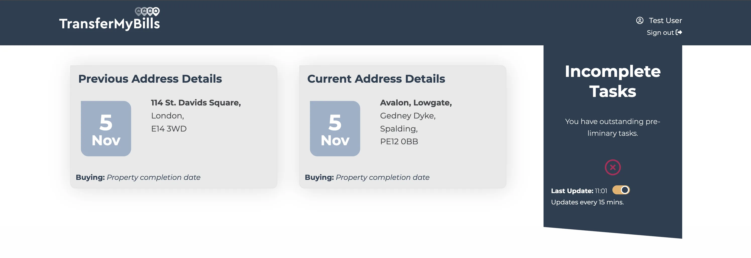
TransferMyBills Client Zone
Product UI / UX
This concept work focused on shaping a client area that could handle onboarding progress, supplier status, customer actions and task visibility without overwhelming the user. It was designed to support a service that needed to feel practical, reassuring and easy to navigate during what is often a stressful life event.
- Clear status communication across multiple request types and stages.
- Expandable interface patterns for balancing detail with scannability.
- A design system approach that could grow with the wider platform.
TransferMyBills Client Zone
Client Area / Product UI
A dashboard concept designed to make a multi-supplier move feel visible, actionable and less chaotic.
The Client Zone concept was built around a practical problem: once a move had been submitted, users still needed a clear way to understand progress, spot issues, provide missing information and manage the different suppliers involved. The interface had to feel reassuring, but it also had to carry a lot of moving parts without collapsing into clutter.
The design therefore focused on status-led communication, expandable request cards, strong visual hierarchy and a layout that could absorb a growing number of transfer states over time.

Dashboard
A central view designed to help users understand the state of their move without needing to chase multiple suppliers individually.

Move State
Address, timing and task state all had to stay visible in one place so users could quickly spot missing information.

User Flow
The dashboard needed to feel connected to the earlier onboarding flow, not like a separate system with a different logic.
Status Visibility
Each section was designed to make state legible at a glance, helping users distinguish what was completed, what needed attention, and what was waiting on an external supplier.
Progressive Detail
Expandable request patterns allowed the interface to stay scannable in its default state, while still making room for more operational detail when a user needed it.
System Growth
The concepts were intentionally modular so the wider platform could introduce new supplier types, offers, request states and customer actions without redesigning the whole dashboard.
Concept Walkthrough
Selected Work
Branding, icons and supporting visual systems

Branding
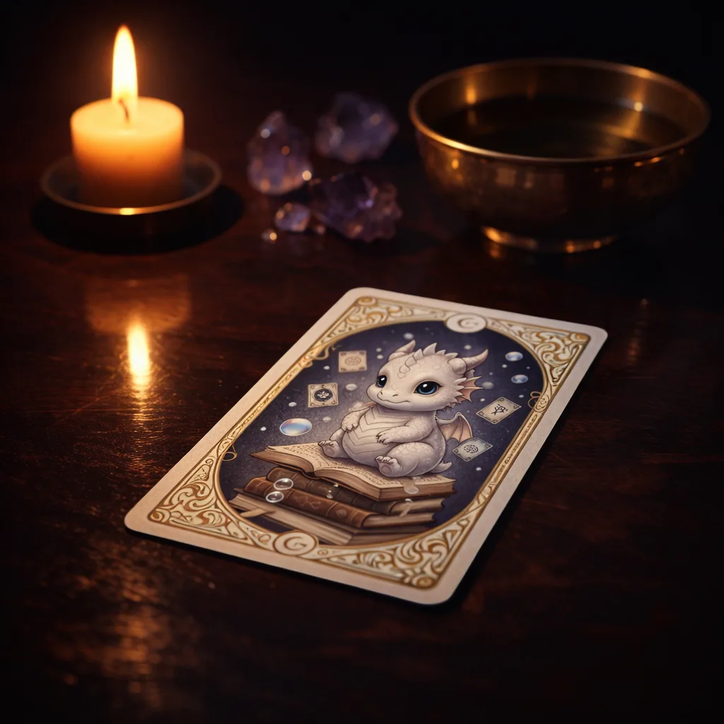
Silver Mystic
Logo and iconography shaped around a mystical visual identity for a new brochure site.
Silver Mystic Logo & Icons
Brand Identity / UI Direction
A mystical identity shaped to feel personal, atmospheric and easy to navigate.
The design work for The Silver Mystic needed to balance two things at once: a distinctive spiritual tone and a website that still felt clear, trustworthy and usable for people booking readings or exploring services for the first time.
That led to a visual language built around a bespoke moon-and-star logo, illustrated service buttons, rich indigo tones, and page layouts that softened the experience without letting the content feel vague or hard to scan.
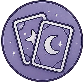
Logo
A custom mark designed to feel symbolic rather than corporate, giving the brand a recognisable focal point that could work in headers, social assets and supporting graphics.
Buttons
Illustrated navigation buttons were created for key service areas so the interface felt tailored to the subject matter instead of relying on generic UI components.
Pages
Page layouts used layered colour, decorative imagery and calmer spacing to create atmosphere while still keeping calls to action and service information easy to follow.
Page Design
The page designs leaned into mood and visual storytelling without sacrificing structure. Large hero imagery, decorative accents and serif-led typography helped communicate the brand personality, while the content blocks remained organised enough for service descriptions, reassurance copy and enquiry prompts.
The result was a brochure-style site that felt more bespoke and immersive than a standard small-business template, but still retained enough clarity to support future expansion into bookings and other content-led pages.
Button Set


Palette & Tone
Deep indigo, muted violet and softer lilac highlights helped create the requested mystical atmosphere, while lighter surfaces kept the interface readable and prevented the experience from becoming visually heavy.
Icon System
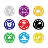
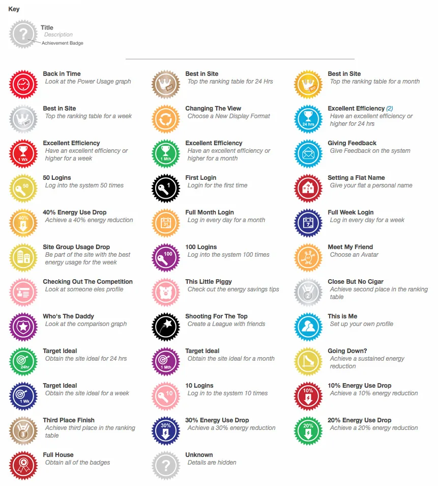
Gamification Icons
A compact icon set designed to communicate progress, rewards and interaction clearly.
Gamification Icon Set
This icon set was designed to support gamified product moments such as progress, rewards, achievements and state changes, with a style that stayed compact and readable across interface contexts.
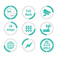
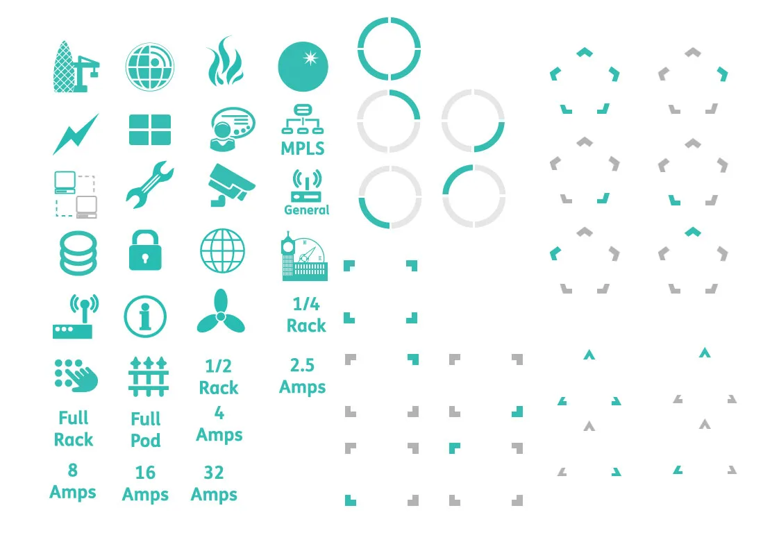
Service Icons
Data Centre Icons
A service-led icon set for communicating technical offerings without visual clutter.
Data Centre Icon Set
An icon set created for a data centre website, designed to communicate technical services more clearly without relying on generic stock-style visuals.
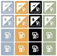
Interface Support
Automotive Set
Iconography built to support a more visual search and filtering experience.
Automotive Style Icon Set
These supporting interface icons were created to make car search and filtering options more visual, helping users read body styles, fuel types and engine information more quickly.